ABOUT THE PROJECT
Secondhand thrifting and vintage shopping has been taking over most social platforms over the last few years.
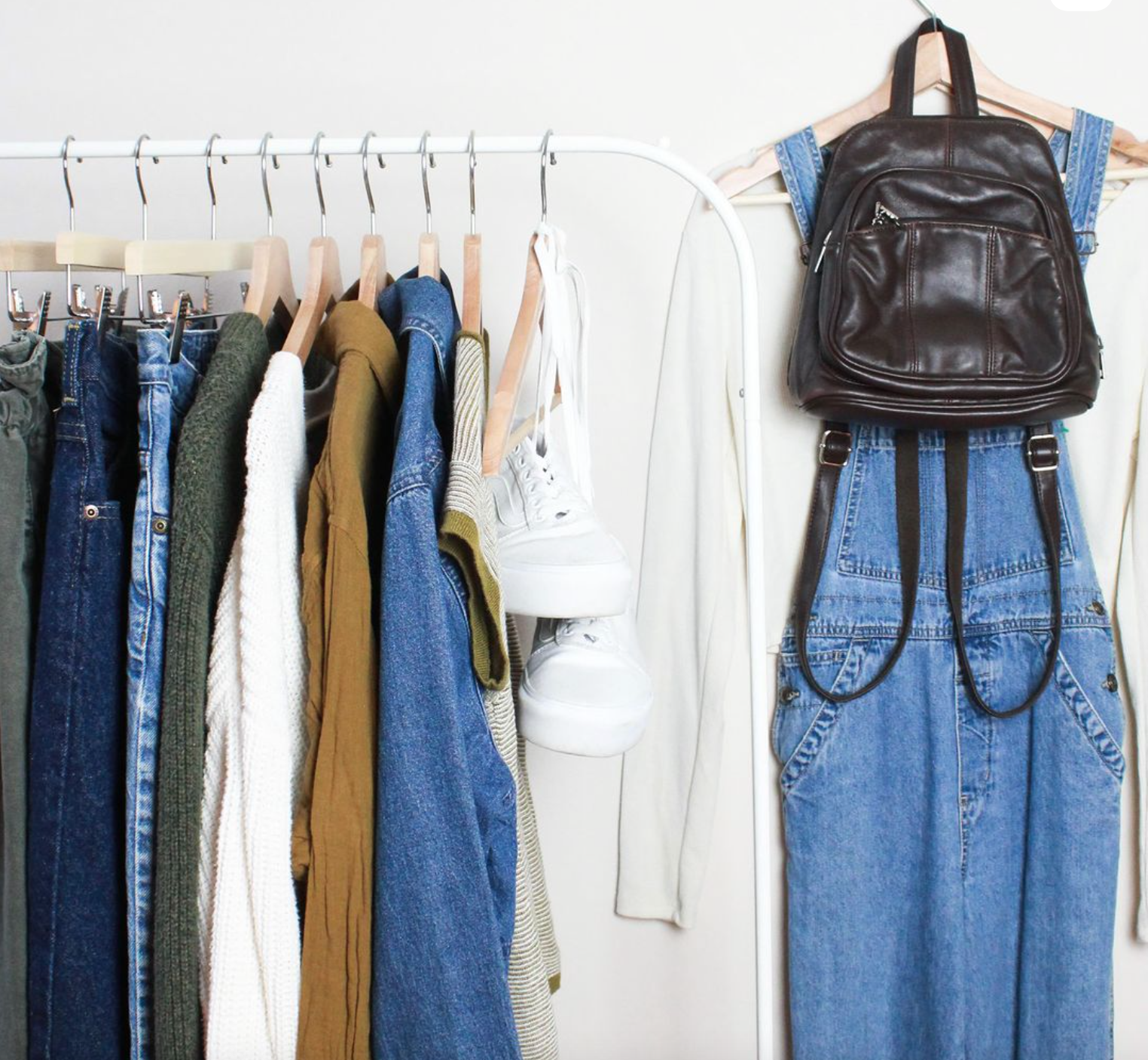
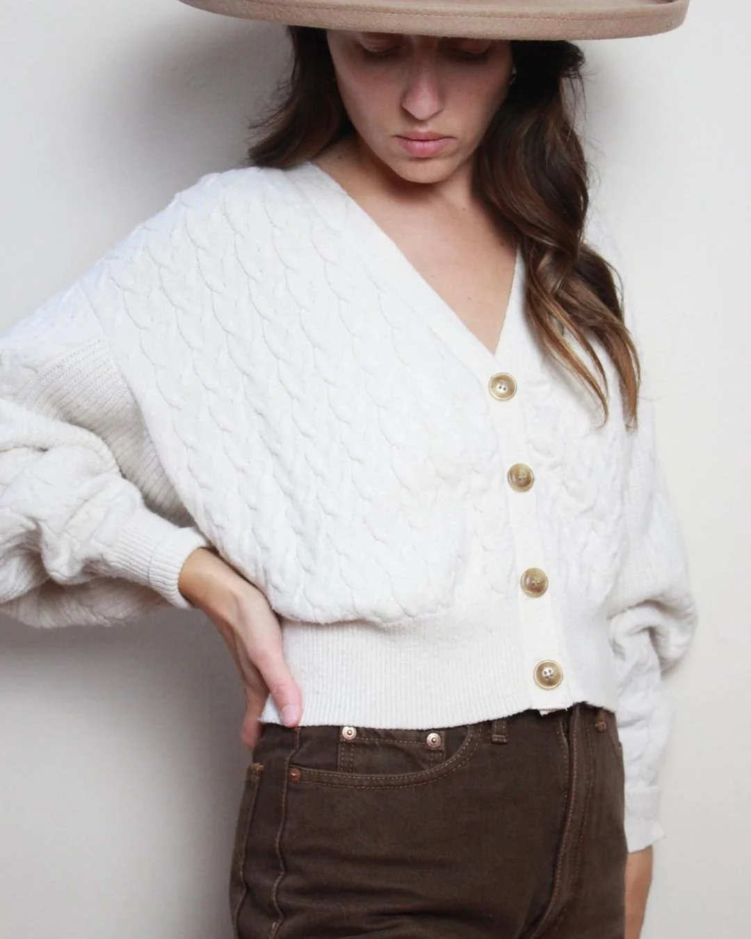
Through story sales, feed drops, ‘bidding wars’, and online storefronts, it has been gaining traction over social media as many accounts have established themselves as trusted, boutique stores that provide vintage apparel, brand-named designers, and high-end retail brands at those ‘secondhand’ prices.
case study ————
Sift + Stitch
-
Brand Designer & Art Director
-
• Logo suite
• Color palette
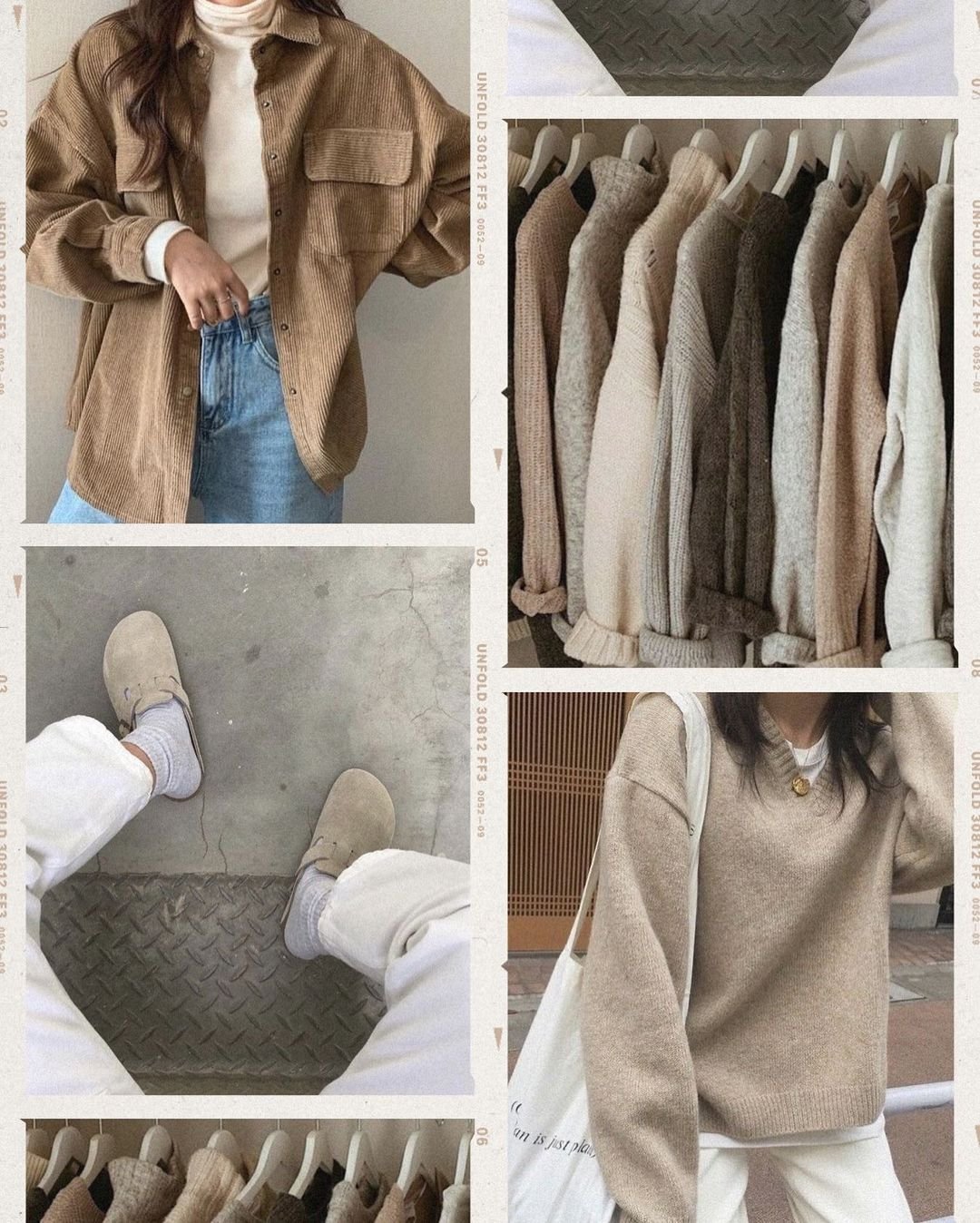
• Moodboards
• Instagram Story highlights
• Photography inspiration
–––––––––––––––––––––––––––––––
meet Kallie
owner of sift + stitch, focuses on lightly-loved, secondhand goods and clothing
––––————————––
The main logo and full suite was completely repurposed and custom-made working with vectorized styling and manipulation.
Focusing on neutral colors, earth-tones, versatile photography, and simplistic graphics, Kallie approached me with wanting to give her shop a fresh face and bring cohesiveness to her audience and brand. Deliverables were a bespoke logo, submarks, color palette and social templates for her profile and other social channels.
The earthy color palette was pulled from previous collections Kallie had sold along with an inspiration board at the beginning of the project.
Based on approval of the main logo, two submarks were designed for print collateral as well as other social media purposes. Since the rebrand, Kallie has seamlessly moved her business from a clustered feed of sporadically styled posts to one with a unified aesthetic, a templated guide of life-styled photography and loyal customers that keep coming back for more.
––––————————––———––


